MTA Turnstile Analysis
Background:
WomenTechWomenYes (WTWY) hosts an annual gala in New York City at the end of May each year in order to connect workers in technology. The goal of the gala is to increase the participation of women in technology and build awareness and outreach. The organization is interested in harnessing the power of data analytics to optimize the effectiveness of street team work, which is crucial to their fundraising efforts. The street team will be placed at the entrances to subway stations to market the event.
Approach:
By analyzing the MTA subway and demographics data of the city, the optimal strategy for the street team can be solved to increase publicity of the gala. In order to predict the ridership behavior of the current year, the data from May of the previous year will be used.
The following sources are used to generate the data:
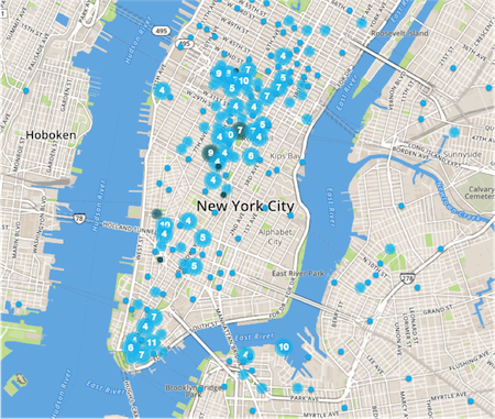
The following map of New York City shows tech companies in blue dots. By observation, there are two major tech hubs: Silicon Alley and Lower Manhattan. Columbia University is another area which can attract aspiring women workers in technology. These are the three regions of focus where the station ridership data will be generated.
Analysis:
The total counts are calculated by the sum of the entries and exits. The MTA ridership data is provided on a daily basis with audits every 4 hours for each turnstile. Each station consists of multiple turnstiles, so the data must be analyzed for each individual turnstile before analyzing the station data. After compiling the counts per 4 hours and per day for each turnstile, the total counts are calculated for each station.
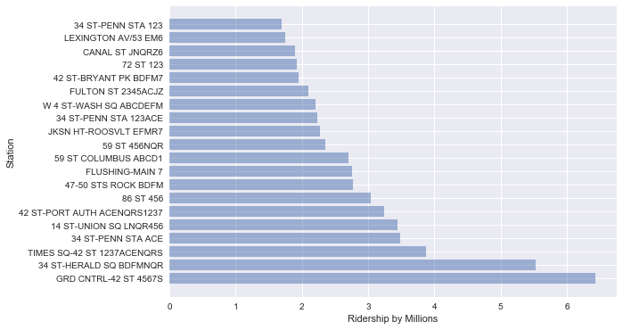
Shown below is the total ridership in millions for the top 20 stations. The most popular stations are Grand Central-42 Street and 34 Street-Herald Square by far, with riderships of over 5 and 6 million, respectively. All the top 20 stations have more than 1 million counts through May 2016, and 15 of them have riderships higher than 2 million. The implication here is that all the top station will receive ample traffic for advertising the event.
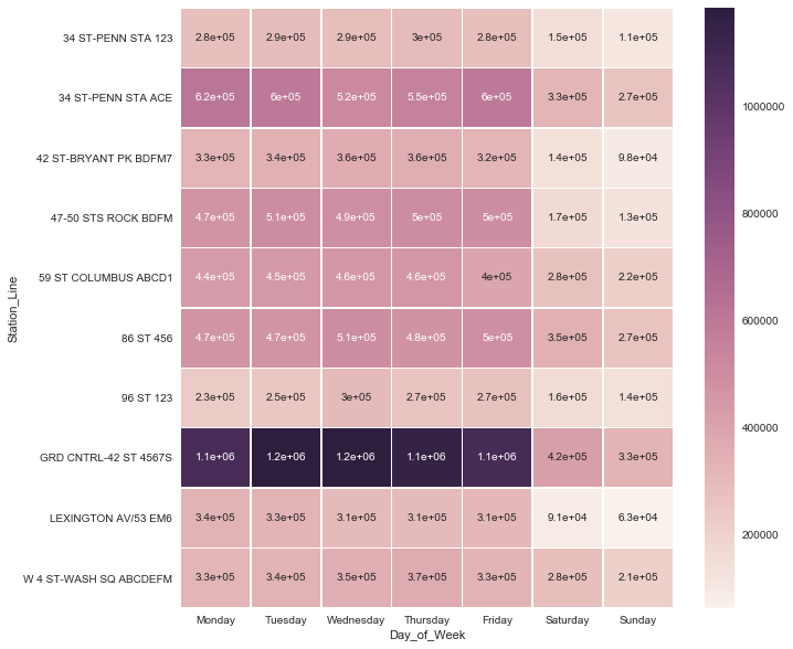
The top stations can be refined further based on the demographical information and proximity to tech hubs. This allows a better analysis of stations that would be best fit for the target audience of women workers in technology. The following figure shows the ridership in millions for each day of the week for the top 10 refined stations. The heat map shows that there are much higher riderships during the weekdays than weekends. However, there is not a significant difference amongst the weekdays. This suggests that most weekdays will provide sufficient traffic for all the stations even if a single optimal day is chosen.
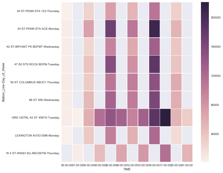
Once the optimal day for each station is chosen, the optimal hours with highest ridership can be analyzed. Here we show the ridership by 4 hour blocks for each station on their optimal day. The time of audits varies by station as shown in the heat map below. The time of audits corresponds to the beginning time of the 4 hour audit blocks.
The heat map shows that highest traffic hours for most of the top stations are 4 to 8pm during late afternoon rush hour. Ridership for all stations was high during the day starting 8am compared to early morning and late night.
Next Steps:
The proposed plan for the street team of WTWY will provide significant increases in exposure to women workers in technology. In order to more accurately assess the optimal marketing time, more data from different months and years should be analyzed in order to observe any variations in ridership behavior through different times of the year. This could mean collecting data from previous months and the same month from several different years. There should also be a more thorough analysis of how to best utilize the availability of the volunteers to construct a schedule that optimizes exposure to WTWY. With these further changes, the marketing strategy can be refined to build even more awareness of the event.